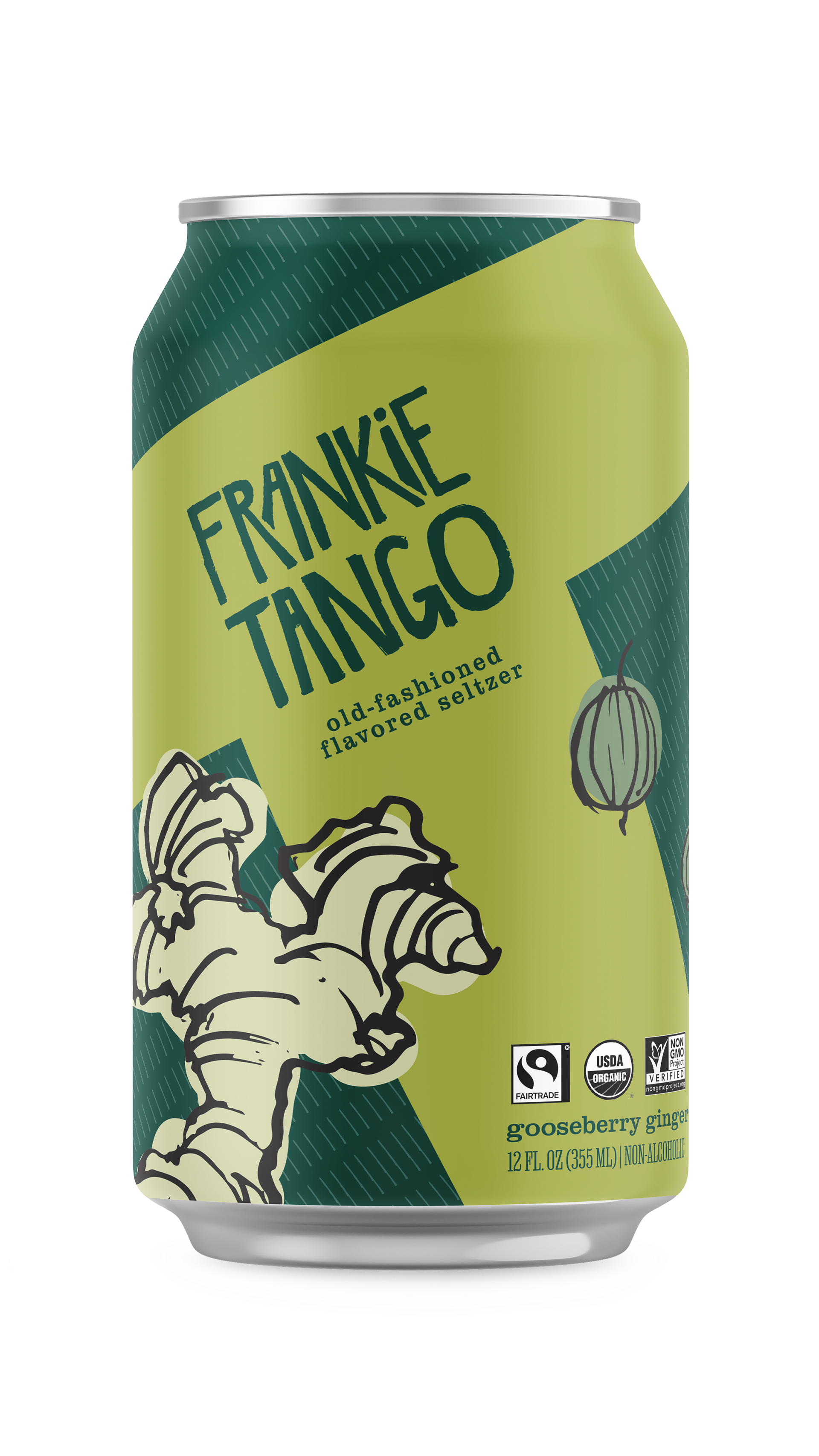
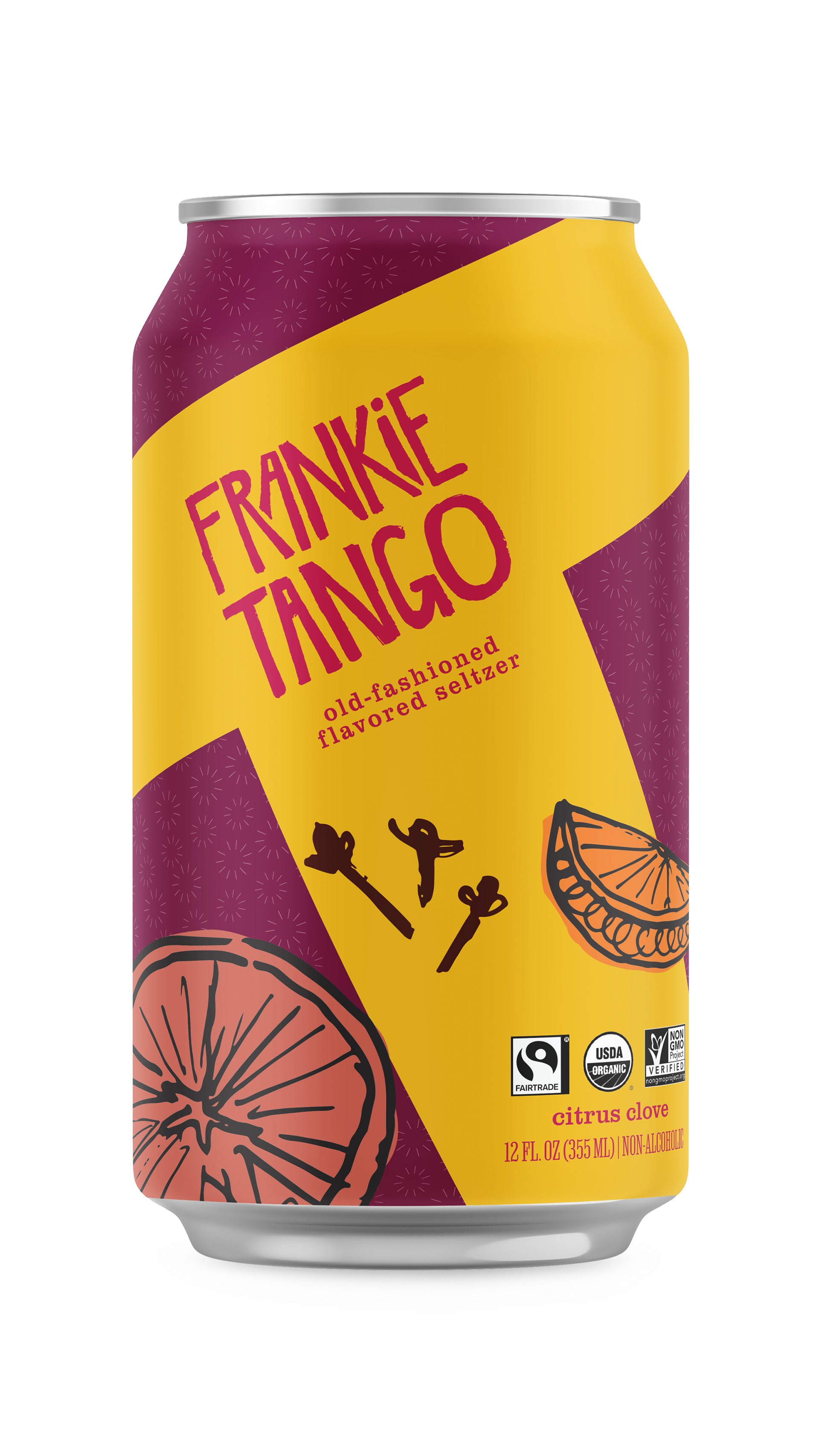
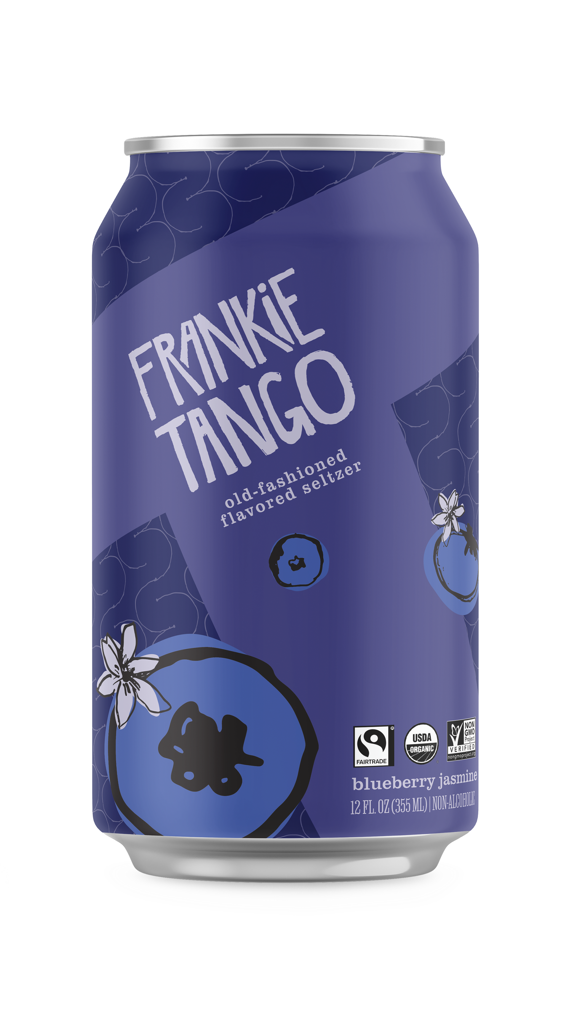
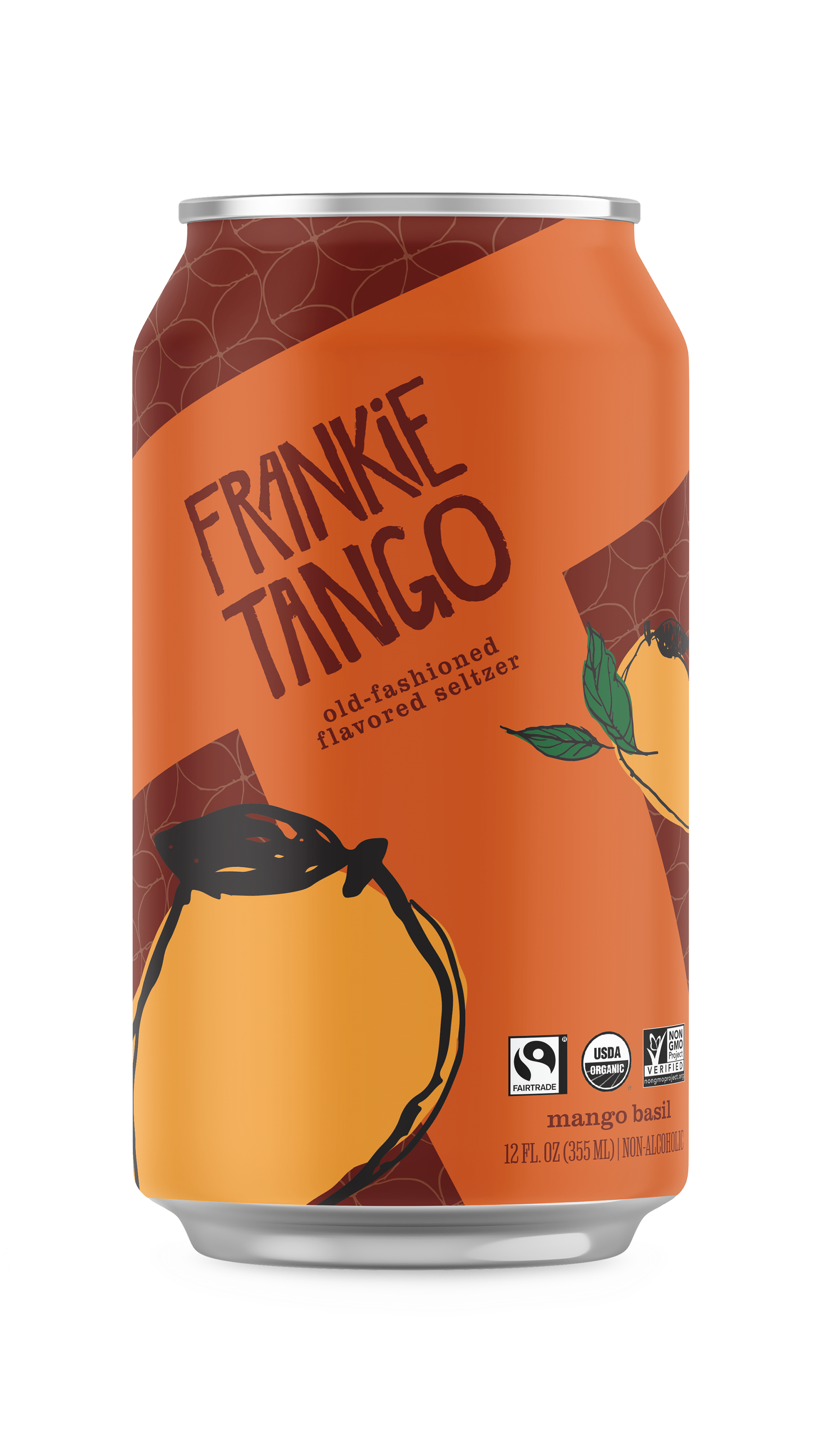
The full line of Frankie Tango seltzers.
Frankie Tango is a seltzer for celebrating the latter years. Life doesn’t end because you stop working– in some ways, it begins! With handcrafted, unique flavors presenting a one-of-a-kind seltzer experience, Frankie Tango is the beverage for making the most of your golden years.
Early ideation.
Typographic exploration.
With a research-driven approach, I sought to find what beverage would best fit my chosen audience of retirement age. Too often we think of the elderly as frail rather than experienced and still full of life. I chose to focus on this aspect rather than the limitations that are often brought to the forefront.
Illustration with ink and nib pen
All the illustrations used in the packaging and promotional materials are hand-drawn using a nib pen and India ink. For the visual style, I chose a midcentury modern inspired style with a hint of global inspiration. Despite its historical influence, I wanted the brand to still feel fresh, but not so funky it was unapproachable, or worse, completely illegible, to its target audience.
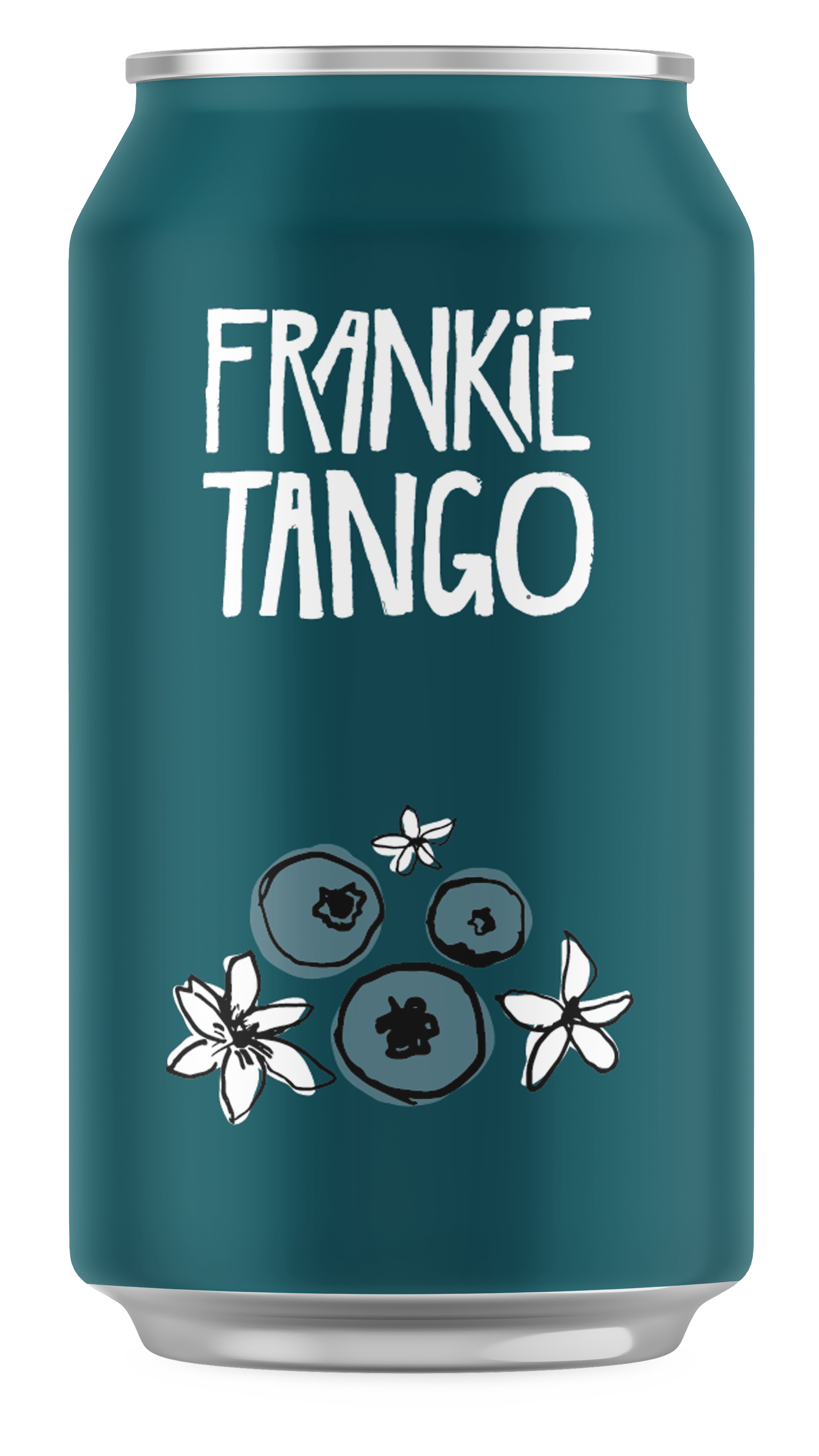
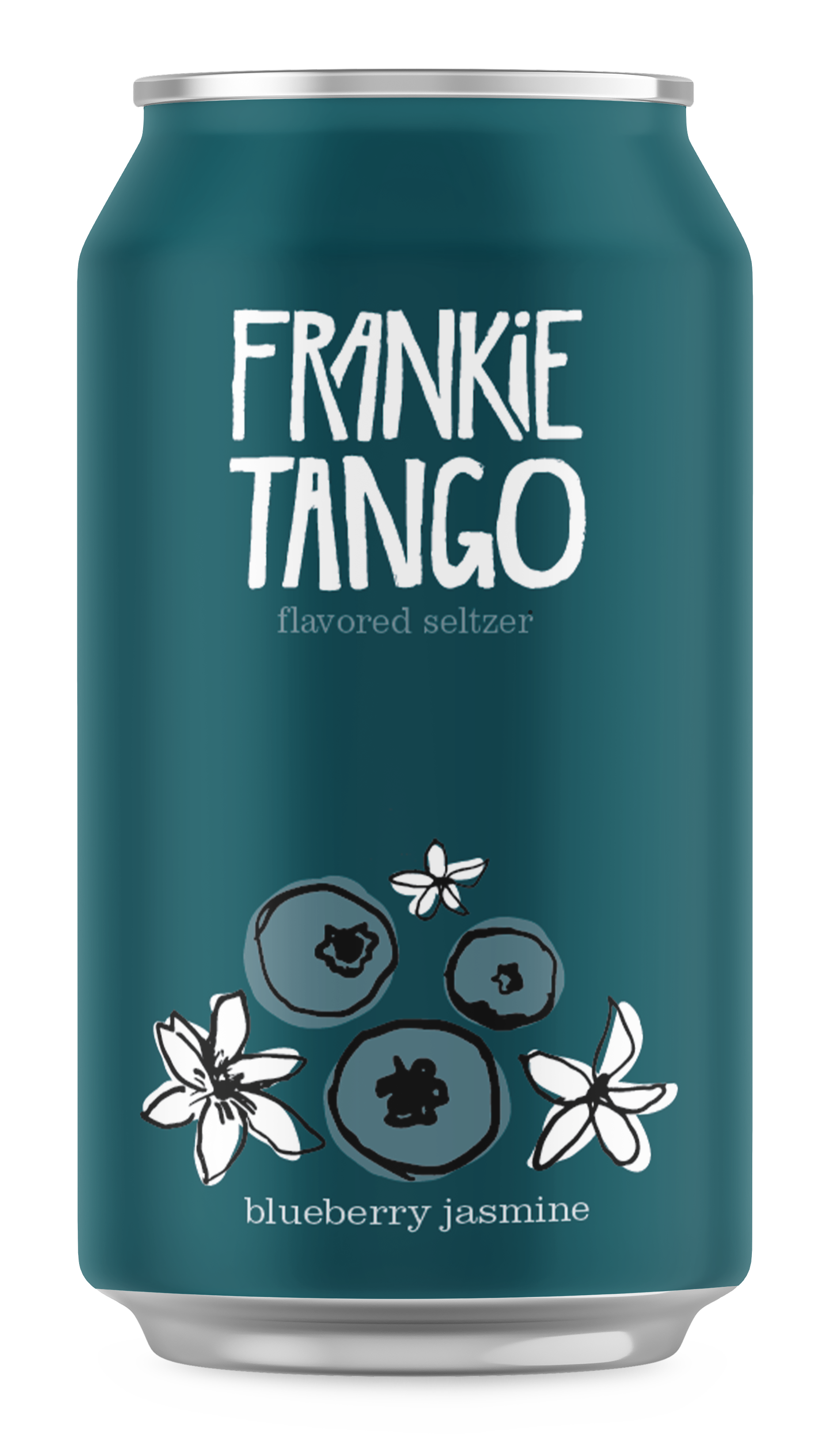
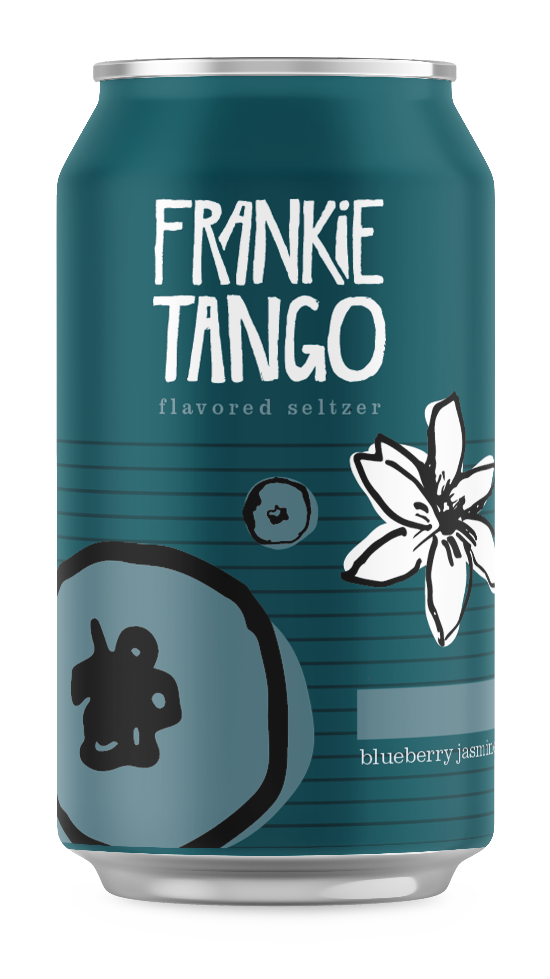
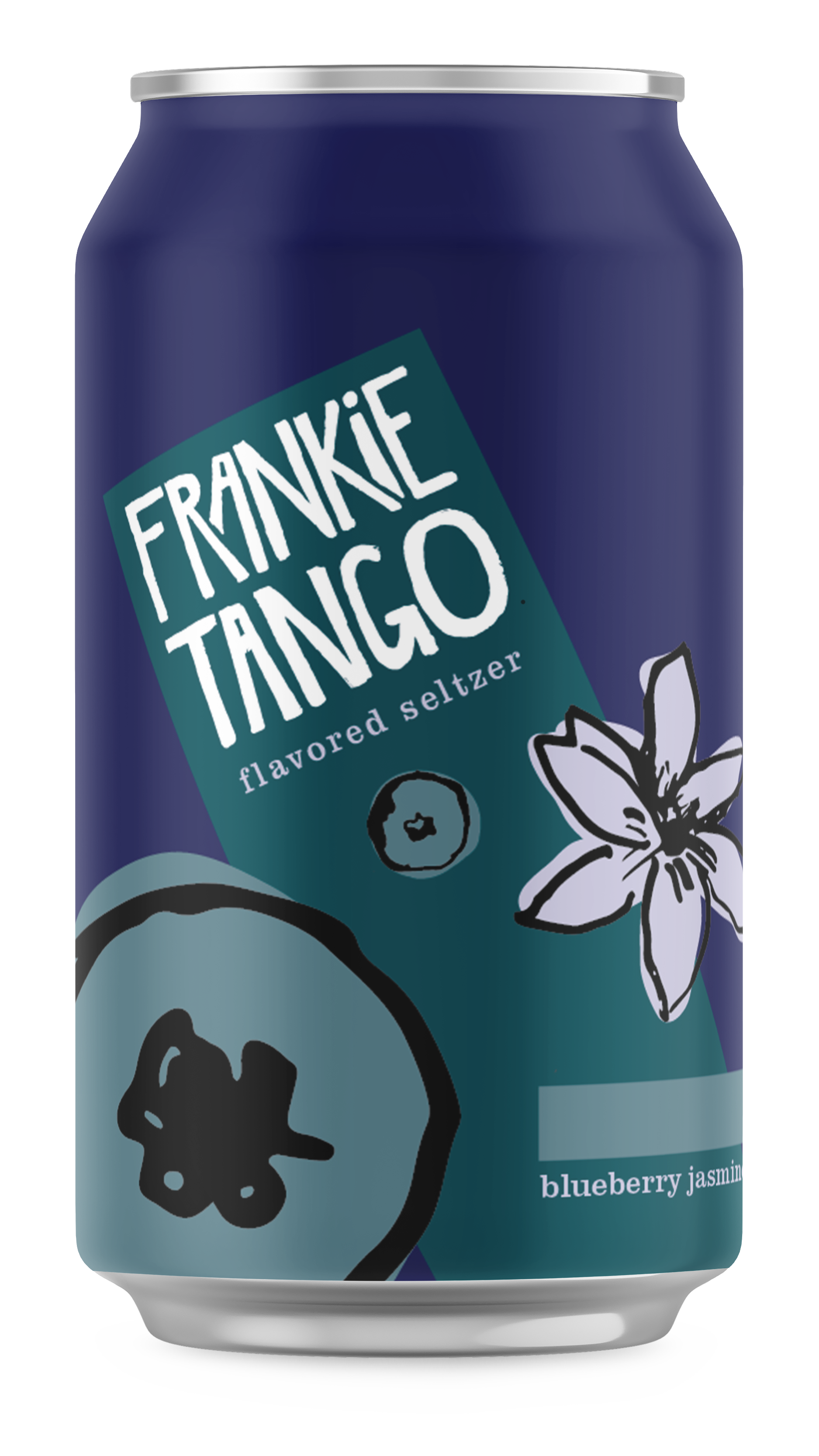
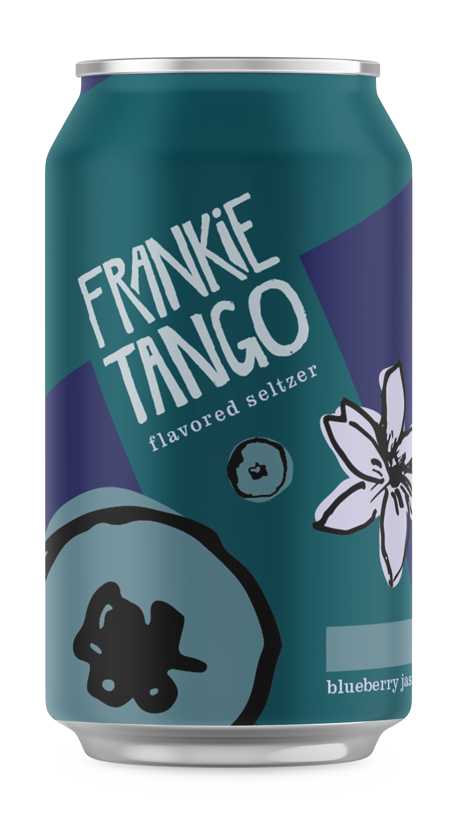
The design underwent several stages of iteration, placing the assets I had created in different ways to evoke the style I was after. Earlier stages didn't have the fun feel I was after, but the angled logo presented other issues regarding readability as well as possibly appearing too youthful for the intended audience. The solution of color blocking with a large letter "T"— for "Tango", of course— felt clever and playful, but still hearkening to midcentury modern styles.
I started out by designing the packaging for one flavor, and then applying the same treatment to the different flavors. But when I considered drinks as a group, I ended up editing the colors slightly so they looked like a more cohesive set.
In order to present the cans in context, I made a TV advertisement to promote the drink to its primary audience. Adults over the age of 65 watch over 4 hours of television a day, based on Statista data from 2024 surveying people 15 years and older.
TV advertisement for Frankie Tango.
For more on the research, packaging, and branding aspects of this project, view my pitch deck below.

