Poster 1, for a global adult audience
Poster 2, aimed at the US young adult population with a political focus.
Using the topic of wildfires, I made this pair of posters, but I wanted to move away from the imagery traditionally associated with both. For poster 1, I took a Neo-Dada, anti-design approach, and took a psychedelic approach for the other. The first poster describes how wildfires and wildfire smoke affect the body, while the second focuses on why wildfires are bad (and getting worse) and how to prevent that through political action.
Poster 1 moodboard
Poster 2 moodboard
Brainstorming and mind-mapping
Early sketching
One of my initial ideas was to have one of my posters aimed at children and be themed around fire safety, but I pivoted away from that idea to ones I found more personally interesting.
Handwritten type exploration
More handwritten type exploration (and some doodles)
I knew from the start that I wanted to combine traditional and digital techniques for these posters, and I started by doing some handwritten type for the human body poster, making a collage, and illustrating the fireman.
Magazine and construction paper collage
Ink illustration (and King Gizzard reference)
After all the physical pieces were ironed out, the posters themselves came together pretty quickly. I colored in the illustration digitally, which gave me lots of room to play with different colorways.
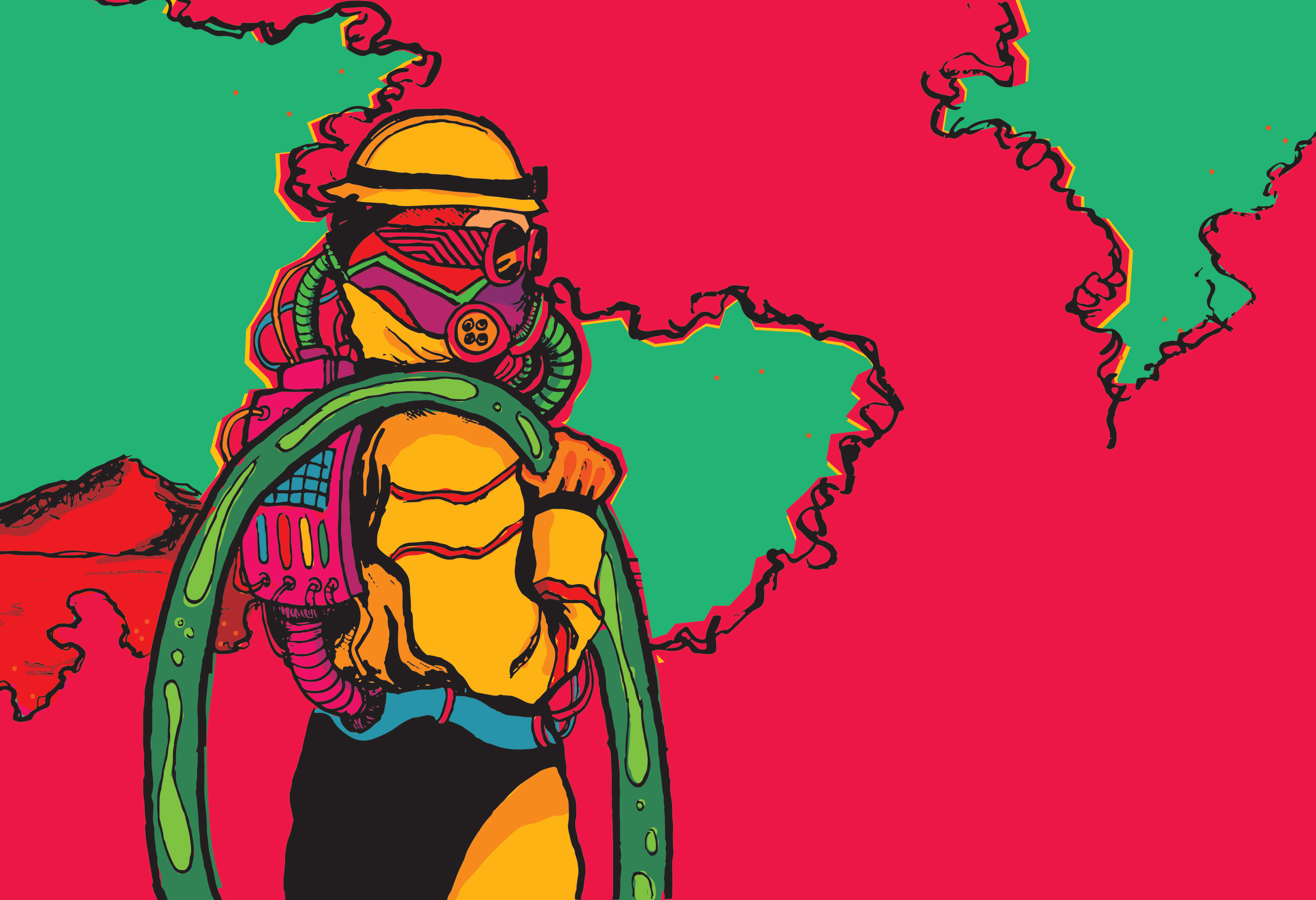
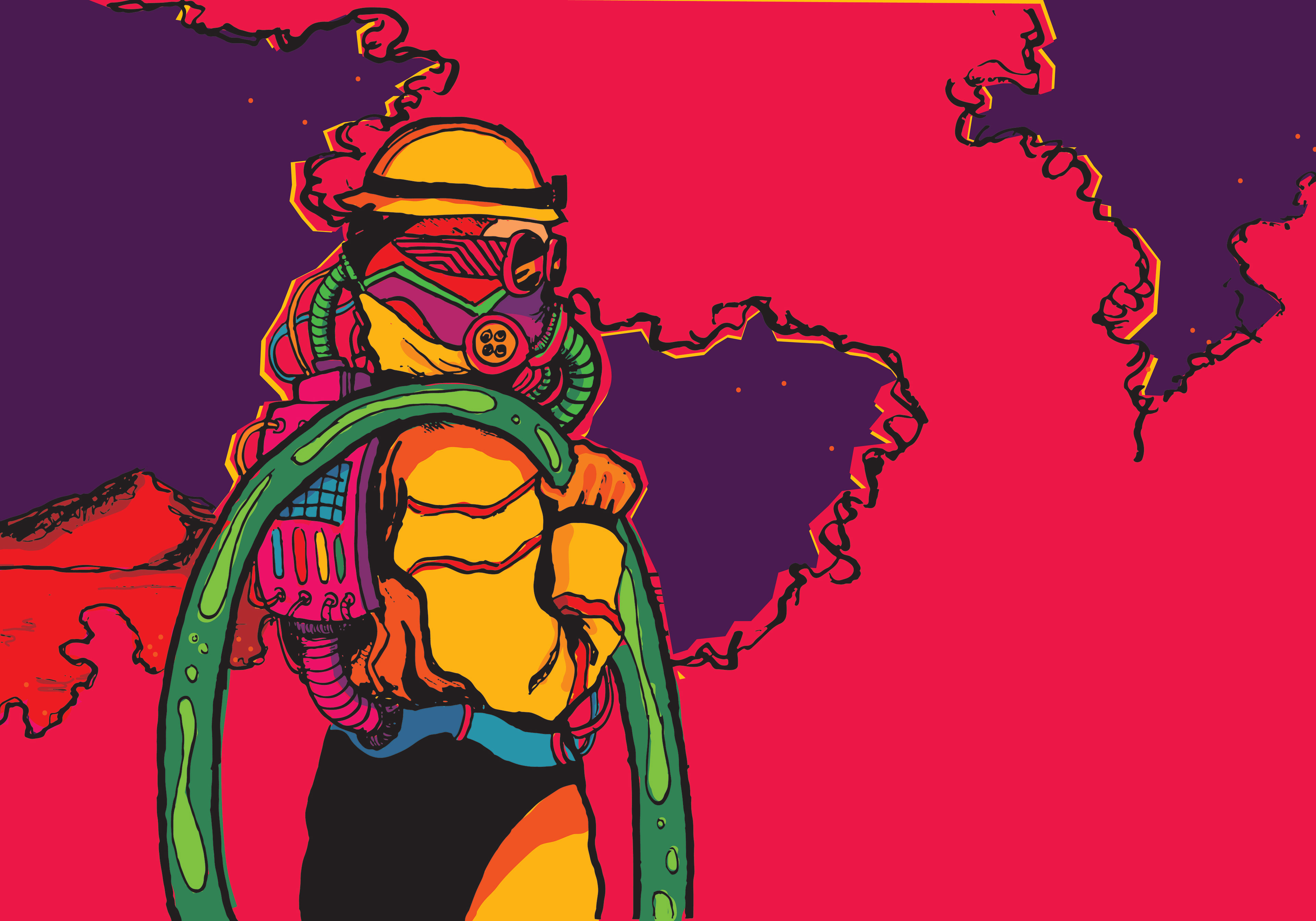
In this first poster, I wanted to establish a very clear grid to make the information stand out against the colorful and chaotic background. This style was very inspired by the psychedelic rock band, King Gizzard and the Lizard Wizard, but I wanted to make sure that the stylistic elements didn't overpower the information.
Final poster
The second poster was heavily inspired by the Dada movement and a strong anti-aesthetic. I wanted to make it a little gross and a little rough around the edges, very DIY. I think the cutting mat-esque background really added to that idea.
Final poster
